Almine Rech Gallery London is pleased to present In Different Ways – an exhibition featuring exemplary painting practices by artists employing divergent approaches to interrogate the medium – from February 3rd to March 26th, 2016.
The exhibition focuses on how artists have developed unique techniques – at times diverse within their own oeuvres – using a brush, airbrush, spray paint, silkscreen and even pouring paint, collaging a range of materials, questioning canvas and wood support structures, or a combination of these processes. Each work is representative of a unique, mostly abstract, formal language, rooted in paintings’ extensive history while also looking towards new possibilities and interpretations for the medium in the twenty-first century.
Justin Adian
The fine line between painting and sculpture is especially blurred in the work of Justin Adian, who produces abstract wall reliefs in pastel palettes that oscillate between and borrow from the two artistic languages. Adian stretches painted canvas over ester foam, which is often mounted to a wooden support. The result is a puffy, geometric composition, often composed of multiple such forms. The works’ formal opacity is tempered by his use of industrial materials and unpretentious titles, which often reference his Texan upbringing.
John M Armleder
John M Armleder is a polymorphic artist whose work twists and turns that displays a highly inventive sensibility. For instance, the same year he produced Capri (2008), a painting made through various, chance-laden techniques and accumulative processes, he also produced a series of mechanically produced, airbrushed designs on aluminum. The layers, evidence of gravity, and “junk-like” material have little in common with the designed patterns on slick surfaces. Capri bears traces of multiple layers of paint applied in splashes and pours, covered in seashells and starfish, bringing to mind various amorphous emotions conjured on an island refuge.
Will Boone
Emerging artist Will Boone uses unconventional materials such as spray paint to render various symbols as seemingly abstract compositional elements. Following those like Jasper Johns, who sought a language that vibrated between figuration and abstraction, Boone uses language as image to achieve this multi-layered form of communication. Also like Johns, his works often reference Americana, such as the symbolic markings left by vagabonds as they travelled through the country during the Depression. Boone works typically on large canvases, anticipating moments of slippage between his designs and the finished product.
Günther Förg
Günther Förg, best-known for his early, monochromatic works, continued to explore modernist themes from a postmodern perspective. He avoided pitfalls of cynical commentary or irony, especially in his later works, such as Untitled (2004), acrylic paintings that appear to be zoomed-in interpretations of compositions from earlier modernist masterpieces; they bear resemblance to watercolors by Paul Klee, the color fields of Mark Rothko or the scratchy marks of Cy Twombly. He appropriates older strategies of picture making yet presents them anew, following contemporary ways of looking at images through, for instance, photographic details or digital reproductions.
Peter Halley
In the 1980s, Peter Halley began his series of “Prison Paintings”: colorful, abstract compositions centered around a divided quadrangle. Inspired by New York City’s gridded urban plan and by his own isolation within it, he imagined the abstract shape as a barred prison cell connected to the outside world through electronic communication. As the subject only gains relevance over time, he updates his content through changes in color, material, and composition. For instance, industrial and quotidian materials such as Roll-A-Tex® create a textured surface that appeals to visual and tactile parts of the brain.
Simon Hantaï
Simon Hantaï produced Etude (1971) through pliage, a technique he invented in the early 1960s. Pliage involve folding the canvas and applying paint, then unfurling abstract shapes and compositions produced through the Paints’ interplay with the canvas’s white ground. The technique privileges the canvas as a textile versus invisible support, and activates it in the work. Following Jackson Pollock, he sought a way of working that repeated neither traditional imagery nor methods. An episode of temporary blindness as a child lead to the creation of this tactile approach that privileged feeling over seeing.
Damien Hirst
Hirst’s “Dot Paintings” began in 1988 and include thirteen sub-series. Phe-Val (2005), from the ‘Pharmaceutical’ sub-series is titled after a chain of amino acids found in a random corporate catalogue. Nine dots are arranged in a grid, with each outer dot touching the edge of the picture plane. Hirst has conceived every composition, using each color only once. His assistants draw each dot with a compass and remove all traces of the human hand in the process, leaving only a precise array of colors that play with the viewer’s perception of the work’s two dimensional space.
Jeff Koons
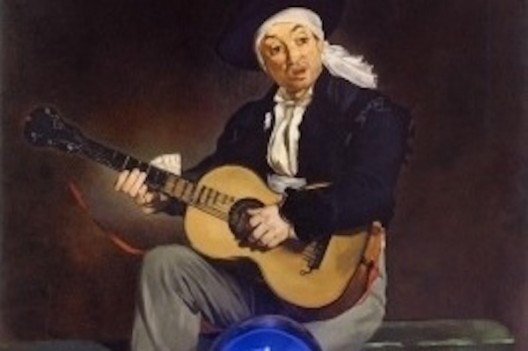
One may think Gazing Ball paintings are the original masterpieces by Leonardo da Vinci or Gustav Klimt, but they are in fact hand-made paintings. Nothing was printed, every mark has been applied by a brush. Each painting comes with its own blue blown-glass “gazing ball”, balanced on an aluminum shelf affixed to the canvas, that allows a simultaneous exaggerated view of the paintings, the viewer, the room. The oil-on-canvas renderings are not intended to be exact copies. They were meant to stand in for the idea of the paintings.
Jannis Kounellis
Employing unconventional materials is a theme that runs throughout Janis Kounellis’ paintings. In Untitled (2014), he has bolted iron plates on top of a red, oil-painted canvas, mirroring a paintings traditional, usually hidden, wooden support, providing industrial reinforcement and added weight to the canvas. The iron material next to the thick oil, with traces of its application through brush and possibly even fingers, creates an energetic, active tension. With plates on either vertical edge and an I-beam shaped bar connecting them horizontally, he recalls a building’s ceiling structure and plays with paintings traditional “window onto a world” illusionism.
Erik Lindman
Erik Lindman eschews traditional easel-style painting, which enables the artist to step back and consider his work from the future spectator’s point of view as he works through a composition. Using tabletops instead, the paintings are seen up-close as surfaces, and Lindman begins by incorporating traces of other earlier compositions or found materials and works them into the painting’s surface such that, ultimately, they are subsumed into a seamless surface. The result is a psychological, “eidetic” experience, similar to how Freud imagined memory as many traces upon a Wunderblock: markings never fully erased, always permanently etched below the surface.
Ernst Wilhelm Nay
An interest in synesthesia, the association of rhythms and sound with visual imagery brought Ernst Wilhelm Nay’s work into the realm of abstraction in the 1950s. He continued to incorporate recognizable imagery, for instance, in the 1960s, ocular shapes stand in for human figures. Seeking out universal modes of communication free of personal references, as time went on, he further restricted in color palette and simplified forms. Yet he employed a painterly style, believing that something human, new and unknown, comes through the act of painting in excess of any intention.
Sarah Parke & Mark Barrow
Husband and wife Mark Barrow and Sarah Parke collaborate to produce multi-step, intricate paintings that draw attention to the medium’s fabric support. They design textiles based on color theories and models, namely RGB and CMYK, as referenced in their titles. Parke weaves the design on a 19th century Jacquard Loom. Barrow then applies paint in dots on the vertices of the textile’s threaded grid, producing an overall, subtle geometric pattern that is perceptible only from a few steps’ distance. Recalling grids and pixels, they blend modernist paradigms with contemporary visual languages to merge figure and ground, conceptually and materially.
Richard Prince
From 2008-13, Richard Prince produced “Band Paintings”, a series inspired by his daughter’s braces. Each center around a black, polygon shape created with an elastic band stapled to a collaged, paint-covered canvas. Up close, traces of newsprint reveal the palimpsest-like process that lurks below the translucent, painted surface. Like this earlier “Joke Paintings”, the series became a fertile exploration driven by the artist’s experimentation within the formal parameters of his abstract logic.
Julian Schnabel
Julian Schnabel’s painting process since the 1980s entails innovative approaches to the painting’s surface as departure point in his large-scale, mixed media explorations. His most recent work began with photographs produced on polyester using inkjet printing, a technique that imbricates image and fabric as foundation for large, expressive brushstrokes and abstract, spray painted marks. These materials also sink intentionally into the fabric, instead of resting traditionally on its surface, so much so that the artist turns over the polyester in the process and often continues the composition backward, to ultimately present the paintings inside out from where they began.
Blair Thurman
Blair Thurman’s Supermodels series, explores the “racecar” through shaped paintings in neon colors that resemble a car’s front grill. Thurman’s work is inspired by contemporary culture and tying it to earlier modernist tropes and associations in such a way that, for instance, a neon sign at a sports bar invokes minimalist works by artists such as Bruce Nauman and Dan Flavin. The shaped canvases at once refer to classical interrogations of a painting’s wood and canvas support while at the same time draw out a macho painterly approach to an extreme, producing something new, conflated with so-called “low brow” culture.
Christopher Wool
Christopher Wool employs a paired-down palette, most often reduced to black-and-white, or one additional color. The chromatic simplicity shifts emphasis to his laborious process: in Untitled (P584), the composition is produced through hand-drawn, spray-painted lines that have been cancelled and erased through layers of wash. He produces a flat surface that bears trace of its production, which is, ultimately, the work’s content. The composition is translated into four silkscreened images tiled together onto one canvas, leaving further trace of its making in the subtle shift in tone and the visible hard edges of the silkscreens.


