Clearly Lichtenstein was critiquing certain Western perspectives of China as much as the ennui of hackneyed images, Chinese or otherwise. But surely he was also making a statement about America’s relationship with China, China’s future, and also the status of his friend and rival, Andy Warhol, within this unique historical context.
The title of the series itself, Landscapes in the Chinese Style, should give pause. What style would that be? The catalog dutifully notes how Lichtenstein was informed by paintings from the Song Dynasty (960-1279 AD) and also certain monochromatic prints of Edgar Degas, who, like so many Impressionists, developed a strong appreciation of Japanese and, to a lesser extent, Chinese aesthetics. (4) Lichtenstein visited exhibitions of East Asian art in New York, Washington, and Boston and perused various exhibition catalogs of Asian art, which according to Gagosian Gallery “may partly account for the emphasis on the secondary nature of his source imagery, deriving from reproductions of original works rather than from the works themselves.”

Landscape with Grass,LICHTENSTEIN,1996
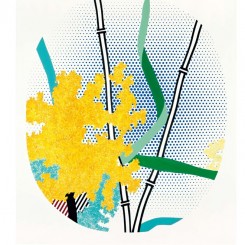
The works are not just reproductions of the Chinese Literati style presented in a formalistic manner. Pop Art’s critique of the Abstract Expressionists and their inarticulate emotiveness is in many ways equally applicable to the “true feeling” of Literati adherents, right up to the present day, however genuine such “feelings” may be. The Literati style, a once radical artistic movement cantered on a retreat to nature and personal contemplation, had become and largely remains a ragged lexicon of tired imagery — a mountain, a tree, a lake, a bird placed just so, with the moronic fastidiousness of an interior designer. Consider “Flowers with Bamboo” (1996). This is a huge work, in proportion with its heroic Abstract Expressionist antecedents but at odds with its Literati contemplativeness. And its blobs of yellow and stylized grass and bamboo sticks do conjure up Abstract Expressionism as well as any of Damien Hirst’s round splatter paintings, and with equal chutzpah and analysis. Whereas Warhol showed how all images were innately debased and celebrated the mundane as something transcendent, Lichtenstein warns us not to be complacent about images — they matter because they affect how you see the world, which is why, in his hands, the most trite speech bubble can become weighty. “Paintings in the Chinese style” ask us to consider what that means, what terms like “landscape” and “Chinese style” mean, not just from a Western viewpoint but also generally.
There are many extraordinary works in the exhibition that should not be overlooked because of their formal restraint. “Landscape with Grass” (1996) is simultaneously beautiful and very funny. Its title is simple yet self-important, like the grass blades themselves, plonked at the front, towering over the “charming” fisherman in his reed hat. The giant “Landscape with Scholar’s Rock” (1997) appears to incorporate Lichtenstein’s very same cast and painted steel “Scholar’s Rock” (1997), creating a discourse about reality and the philosophy of things. It would be nice one day to see these works exhibited with Zhan Wang’s own stainless steel scholar’s rocks, which also “reflect” on Literati limitations and weaknesses while simultaneously indulging in them (see his current show at the Ullens’ Centre in Beijing).
Most impressive is “Landscape in Fog” (1996). A mountain’s black silhouette is sandwiched between two ribbons of blue — sky and sea — themselves separated be a Willem de Kooning-like cloud-swirl of Expressionist paint that rips across the middle of the picture, tearing in two the restrained formalism of the Ben-Day landscape. Here I am reminded of Gerhard Richter’s photographs scraped over with paint. The intentions are really similar: to critically fuse two disparate traditions with an almost casual destructive gesture. Again Lichtenstein provides levity, with scant vegetation in the foreground, the prologue to the opera behind, and a twisted grasshopper-like tree with little tufts of jaunty color (apparently also the basis for one of the artist’s sculpture scholar’s rock in the exhibition). In some respects these jokes play the role of the speech bubble in Lichtenstein’s earlier works — “Whaam!” and “I don’t care. I’d rather sink than call Brad for help.” — only here the intention is not to punctuate but to deflate.
This is an important exhibition, one that has not received the serious attention it deserves. My few words here are but a short introduction to the subject. Warhol is only one side of the Pop story, while these late works from Lichtenstein are as eloquent an epitaph as one could wish for.
(1) Bruno Bischofberger is a storied Swiss gallerist, famous for bringing American Pop Art, Conceptual Art and Neo Abstraction to Europe, including artists as diverse as Warhol, Lichtenstein, Jasper Johns, Claes Oldenberg, Dan Flavin, Donald Judd, Jean-Michel Basquiat, Bruce Nauman, On Kawara and Joseph Kosuth. His philanthropy over many years towards Artforum means that his kitsch, bucolic photos of Swiss village life now consistently and wryly decorate its back cover.
(2) G. Frei and N. Printz, eds., The Andy Warhol Catalogue Raisonné: Paintings and Sculptures 1970–1974, Volume 3, (London and New York: Phaidon, 2010), 165.
(3) Warhol, an omnivorous media consumer, was probably aware of a weird 1952 photograph commissioned by Salvador Dali from the surrealist photographer, Philippe Halsman, which merged Mao’s official portrait with an image of Marilyn Monroe — another famous Warhol muse (the montage image was used for the cover of Vogue magazine in its December 1971–January 1972 issue — goodness knows why).